
Summary
This project examined various factors as they related to whether or not high-achieving high school orchestral musicians in the Chicago Youth Symphony Orchestras (CYSO) chose to continue on in music at the college level. Key takeaways from the project are listed below:
-
While a causal relationship cannot be firmly established, the availability of financial aid is a very strong predictor of CYSO student’s continued success on their path to becoming professional musicians.
-
Asian students are much less likely to major in music than other students.
-
Caucasian students are the most likely to major in music, but are not statistically differentiable from African-American or Latino students.
-
The type (public vs. private) or location (city vs. suburb) of a school does not strongly influence whether or not a student will major in music.
For those interested, technical details of the data modeling are in the last portion of this blog post. The associated code and anonymized data is available in the project’s repository on GitHub.
Diversity in America’s Professional Orchestras
In 2016, the League of American Orchestras released a study showing that people of color were largely underrepresented in professional orchestras nationwide. The musicians in American professional orchestras on average are 86% white, a statistic which has changed very little for decades. Some gains have been made in this area over the past two decades, especially in regards to Asian musicians. Musicians of Latino or African-American descent remain largely underrepresented

Diversity statistics within American professional orchestras from 2002 to 2014. (‘Racial/Ethnic and Gender Diversity in the Orchestra Field’ (2016) League of American Orchestras)
These statistics are of great concern to those within the classical music world, and especially amongst orchestras in Chicago, which is one of America’s most diverse cities. To this end, several of the city’s leading classical music teaching institutions have formed a partnership to understand and enhance their roles in cultivating diverse professional musicians of tomorrow. This group, the Chicago Musical Pathways Initiative, was built to identify talented, motivated students early in their training, provide them with the resources they need to help them achieve their full musical potential, and ultimately to increase diversity in America’s professional, musical landscape.
A leading member of this partnership is the Chicago Youth Symphony Orchestras (CYSO). The CYSO is one of the world’s truly elite youth orchestras, with graduating students regularly continuing on to study music at nonpareil conservatories and universities such as Juilliard and Eastman. With the mission to inspire and cultivate personal excellence through music, the CYSO is especially concerned about their ability to enhance the number of students of color and students from lower-income backgrounds proceeding on to study music at the college level.
To this end, the CYSO has asked me to examine the demographic data of their graduating seniors, who have reported their chosen university and major upon departing the organization. The CYSO was able to provide me with information such as gender, ethnicity, and level of financial aid for students that graduated between 2012 and 2018, and wanted to know which factors are most important in determining which students will go on to major in music in college (the CYSO has a 100% college attendance rate for their graduating students). This data was anonymized before processing, to remove any personally identifying information about CYSO students.
With a problem as complex as this one, involving many different features and human motivations, it is difficult to disentangle the interaction effects different features may have one one another using simple comparative statistics. For example, lets say we do a basic analysis of the data and find that:
- Asian students are more likely to major in music than Latinx students
- wealthy students are more likely to major in music than less wealthy students
- Asian students are more likely to be wealthy than Latinx students
In this scenario, how can we disentangle various factors to understand correlations between important factors? Past that, is it possible to infer causality from out data, i.e. is it that wealthy students (who happen to be Asian) tend major in music? That Asian students (who happen to wealthy) tend to major in music? Do both factors matter?

Workflow for analyzing diversity in the CYSO’s pipeline to professional orchestras
One way to address a problem like this is to build a statistical model that can look at all of the different factors at once instead of individually. In data science, this particular type of problem is called a categorization problem – we want to categorize which students will be music majors based on their characteristic attributes, such as gender and ethnicity.
To look at all of the CYSO’s data in unison (as well as some supplementary data such as high school and university statistics), I have built a machine learning model. The model trained on the available data about CYSO students, and returns a set of equations. Once this is done, we can build a hypothetical new student (e.g. female, Latina, lives in the suburbs, etc.) and predict the likelihood that they will major in music. Classification machine learning models like this one are now being used all across industry and the private sector.
Analysis Results

The influence different sociodemographic attributes have on a student’s decision to major in music in college. This type of graph is called a ‘box and whisker’ plot, and represents the results of over a thousand different machine learning models. The ‘boxes’ show the importance of a given attribute in most of the models, and the black bars, or whiskers, show the full range of attribute importance across all models.
Beyond the predictive capacity of the model, we can now quantify the relative importance of different student attributes on determining whether or not a student majors in music. The above plot shows some of the coefficients of 1000 different machine learning models I have run using CYSO data. Student attributes that plot further to the right strongly influence a student’s decision for majoring in music. For example, the coefficient for ‘financial aid’ (highlighted blue) lies far to the right. This means that giving a student financial assistance makes them much more likely to major in music. Coefficients that lie far to the left are the opposite, and strongly influence a student’s decision against majoring in music. For example, the coefficient whether or not a student self identifies as ethnically Asian (highlighted red) lies far to the left. This means that Asian students are much less likely to major in music than, white, black, or latino students. The black line down the middle of the plot shows where the value of coefficients is zero. Student attributes that lie on or near this line have relatively little or no influence on determining whether or not a student majors in music
The reason for plotting the data this somewhat confusing way, and using 1000 slightly different machine learning models, is to give a broad confidence interval for each student attribute. Attributes with that lie near the center line, especially those that have ‘whiskers’ that extend across the center line, are not reliable predictors of future student behavior. For example, in the below plot, I show the relative coefficients for high school statistics, comparing public vs. private schools, and City of Chicago schools vs. suburban schools. All of these coefficients lie near or on the centerline. As such, the type of high school that a student attends does not really matter in predicting whether or not they will continue on in music.

The influence different educational attributes have on a student’s decision to major in music in college
Finally, one very important note that should be included when considering this work: the results shown above are a way to cleanly separate and understand the correlation between factors like student aid availability and continued success. However, they do not imply causation, and should not be interpreted as such. For example, it is ok to conclude ‘students who have available financial aid for music are more likely to major in music in college’, but it is not correct to conclude ‘the availability of musical financial aid causes students to major in music in college’. While that latter statement may very well be true, it cannot be inferred from this set of data or this type of analysis. There are methods that can be used to infer causation in cases like the one we analyze here today. However, attempts to re-pose the problem in causal inference frameworks like ‘difference in differences‘ quickly revealed that the amount of data available was not sufficient to provide meaningful causal insights. As such, extra care is warranted when considering the correlations revealed by our analysis.
Technical Recommendations
In today’s data driven world, many non-profits are utilizing data science to help understand how to target their resources to better fulfill their core goals. Going forward, best practices on data retrieval and maintenance can greatly enhance an organization’s ability to utilize the increasingly capable and available abilities of machine learning. To this end, here are few basic suggestions that may be fairly easy to implement:
- Use unique identifiers such as student ID numbers for students. This allows students to be easily tracked across different records, and can also provide an additional layer of information security if personally identifying information is stored separately.
- On registration forms, use dropdown menus whenever possible (instead of fill-in-the-blank). This prevents mismatches between identical fields (e.g. ChiArts vs. The Chicago Highs School for the Arts).
- For future studies of diversity, attempt to obtain anonymized socioeconomic data, such as household income, for as many students as possible (not only students who apply for financial aid).
This project also uses only data from students graduating from CYSO and continuing on to college between 2012 and 2018 (2012 is when detailed demographic data tracking began). However, there is considerably more data for the full suite of students within CYSO. I have built a tool to analyze demographics across different regions of Chicago that CYSO can apply to their broader data set in the future.
Technical Details
Data
As with most data driven investigations, the first step is to sift the data. For this particular project, this meant lining up the records of students from disparate spreadsheets. The only unique identifier for each student across each type of record was their first and last names. However, finding an exact match between records using names as a primary key proved difficult because of misspellings and nicknames. For example, in one spreadsheet a particular student may be listed under a shortened name (e.g. Sam Jackson), while in another, a student may be listed under their full name (Samuel Jackson).
To semi-automate this portion of the work, I built a set of matching algorithms based on Python’s Fuzzy Wuzzy package. Fuzzy Wuzzy works by optimizing the Levenshtein distance between a word and a set of potential matches, which is the number of permutations required to transform one word into the other. This tool managed to work in the majority of cases, particularly when the names we’re pre-formatted to remove spaces, hyphens, symbols, and suffixes. However, particularly difficult cases had to be dealt with manually. Common causes of mismatch were:
- Anglicized names (e.g. Jingjing Huang vs. Jennifer Huang)
- Distant nicknames (e.g. Peggy Jones vs. Margaret Jones)
Once the internal CYSO records were matched up and regularized (often using Fuzzy Wuzzy), I used supplementary data sources to add additional student attributes. Because student-specific household income information was not available, I used postal code level median household incomes to try and capture more of the socioeconomic influences on student’s choice of college major.
For the sake of simplicity, I did not differentiate between different kinds of music majors (e.g. music performance, music theory, music education). With only ~500 samples, there wasn’t enough data to support multi-categorical classification, especially with respect to unbalanced features (e.g. <10% african american students). I was able to confidently differentiate between music majors and non-music majors using only a few key terms
- performance
- music
- violin
- songwriting
- perfomance
- bass
- cello
- viola
- jazz
Model and Feature Exploration
To begin, I applied a wide set of machine learning models to my data using Python’s Scikit-Learn library. Specifically, I used a cross validation grid search of a large hyperparameter space for the following models:
- Logistic Regression (with L1 and L2 norms)
- Support Vector Machine (with linear and radial basis function kernels)
- Random Forest
- Gradient Boosting
Because of sensitivities to minority classes in the cross validation data splitting (more on this in a little bit), I ran an ensemble of 20 of each of these models, using Monte Carlo methods to alter the data resampling and stratification for each cross validation model suite. Because of the non-uniform model types (e.g. comparing linear regressors to decision trees), I used Log-Loss as a universal optimization metric, as it accounts for the degree and direction of misclassification within a given model. I also made sure to separate co-linear features for the logistic regression models (e.g. I would only use one of my ‘male’ and ‘female’ features).

Receiver Operating Characteristic (ROC) curves for 6 different machine learning models used in this work
The initial results of the modeling can be seen in the above set of ROC curves. This type of plot compares the false and true positive rates of our models as a function of threshold. Better models lie closer to the upper left corner (or more formally, better models have larger integrated areas underneath a their curve, or a larger ‘AUC’). As can be clearly seen, the logistic regression (l1 & l2) and support vector machine models (linsvc & rbfsvc) are almost indistinguishable. These models are significantly outperformed by the decision tree based techniques random forest (rf) and gradient boost (gb).
However, we ran these models in a cross validation framework for an important reason. The purpose of cross validation is to make sure that our model has an appropriate tradeoff between bias and variance (side note, for an amazing visual representation of the bias/variance tradeoff, check out this link). We can check to see how our model is doing outside of the cross validation by using an additional holdout test set of data that we separated before beginning to use a grid search for the best fit hyperparameters.

Comparison of best fit model of each type to additional holdout set of data
What we are seeing in this bar plot is that both our random forest and gradient boost models are overfitting the data. That is to say, they train very well to make an accurate separation of data, but when given new data they haven’t seen before, they don’t work nearly as well. After a deep dive into the data, as well as a bunch of test modeling, I realized that this overfitting was quite unstable. On some data sets, the random forest and gradient boost methods would work quite well, but on others, they would substantially overfit. The reason for this overfitting is actually a sensitivity to minority classes within my features. Specifically, certain student attributes (e.g. being african american) were unbalanced enough within the data to make the decision tree methods unstable.
There are several methods of dealing with unbalanced data, including such classics as undersampling, oversampling, and SMOTE. After spending some time messing around with all three of these options, I decided to revisit the basis of the problem I was trying to address. For this work, I am not actually that interested in building a hyper accurate classifier. What is important is identifying and quantifying the major factors that drive students to major in music. This can be done just as well at 85% accuracy as at 90% accuracy. I decided to settle on a single model type for rest of the work: Logistic Regression with an L2 norm for several reasons:
- The decision tree methods were very unstable to perturbations in minority features.
- The logistic regression models were slightly more accurate than the SVC methods.
- The logistic regression models were computationally much faster than the SVC methods.
- Logistic regression coefficients are interpretable.
- The L2 classifier was more stable than the L1 classifier across Monte Carlo cross-validation tests.
Model Suite
Even though the logistic regression classifier I ultimately chose to work with was fairly stable to different splits of unbalanced features, I decided to run an additional ensemble of models to gain confidence in quantity and quality of the fit. As such, I ran a suite of 1000 models using Monte Carlo methods to split the data in different ways during cross validation. Specifically, I altered the data which form the basis for stratification in cross validation.

ROC curves for logistic regression model suite. All 1000 models are plotted in light grey, and one specific model example is plotted in dark blue.
The ROC curves for this model suite showed a consistent, stable model. The variance between models at any given threshold is quite small. As such, I have confidence in the mean values of the logistic regression coefficients, which are the basis for understanding how different student attributes influence a student’s decision to continue on in music in college.

Above we have box and whisker plots for the logistic regression coefficients for each student attributes included in the model. One of the advantages of logistic regression over other machine learning classifiers is that these coefficients are directly interpretable (e.g. we can use them to say things like an ‘increase of X% in financial aid will make a student Y% more likely to major in music’). However, it is important to note that the data that was used in the models, particularly in order to avoid mayhem during the hyperparameter tuning, was regularized using various scalings. If interested, the scalings are available on the github page associated with this project.


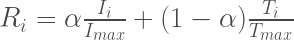
 is the rank given to the i-th station and ranges from 0 (least preferred) to 1 (most preferred).
  is the mapped household income at the i-th station,
  is the maximum mapped income among all stations,
  is the daily foot traffic at the i-th station, and
  , which also ranges from 0 to 1. A low
  . This means our rankings are mostly powered by income (we strongly prefer targeting rich areas), but also take into account footfall (stations with a large amount of passengers should still be targeted).